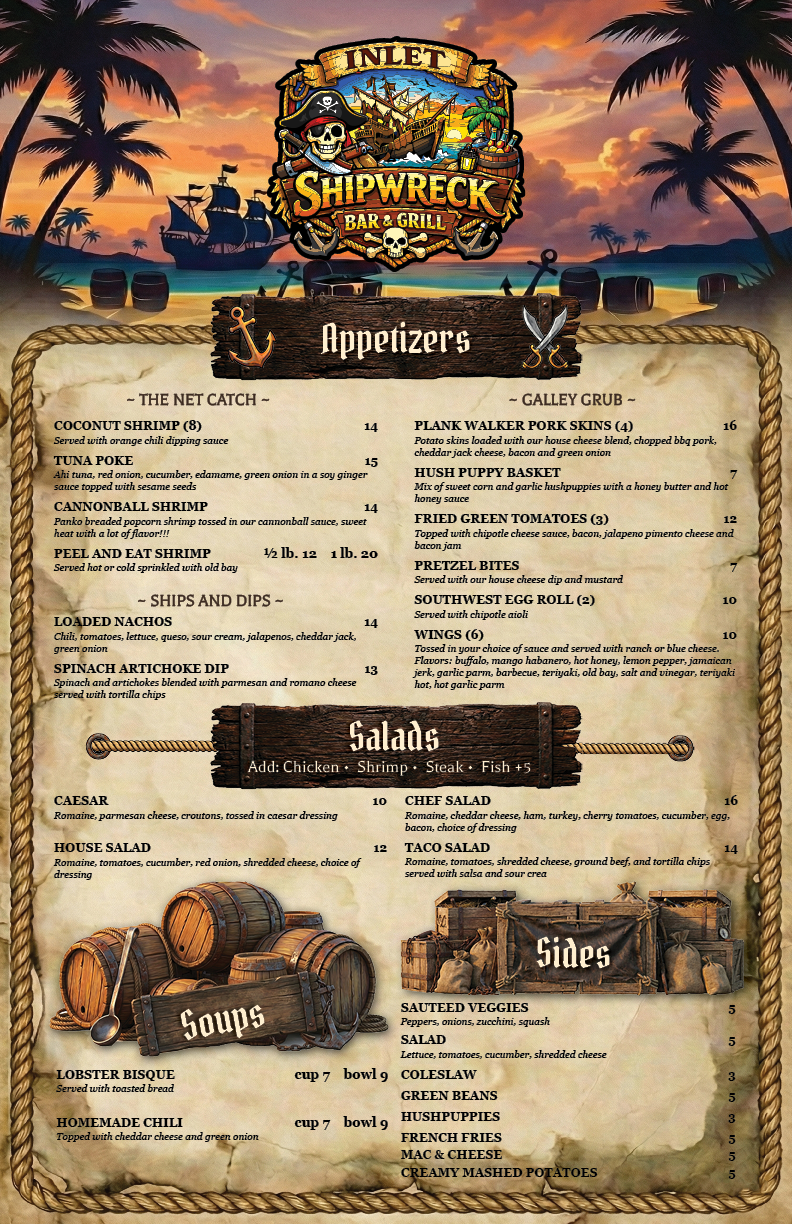
// [1/3] The primary visual identity for the menu, featuring distressed nautical textures.
Project Overview
The Inlet Shipwreck menu project was more than a layout task—it was an exercise in Menu Engineering. Located as a staple of the Murrells Inlet marshwalk, the objective was to combine a "nautical/weathered" aesthetic with proven marketing psychology to influence customer behavior and highlight high-margin items.
Applying eye-tracking data to physical menu layouts.
Professional print-ready assets produced in Adobe InDesign.
Strategically placing high-margin items in the 'Sweet Spot'.
01 // Design Principles & Psychology
This project served as a foundational learning experience for applying design psychology to physical media.
Key Concepts Implemented:
- The "Sweet Spot" Strategy: Strategic placement of high-contribution items in the top-right and center-top areas of the menu, where eye-tracking studies show customers look first.
- Typographic Hierarchy: Using font weight, size, and custom dividers (the "Rope" and "Anchor" elements) to guide the reader through the categories without cognitive overload.
- Visual Anchoring: Positioning high-priced "decoy" items near target dishes to make the latter feel like a better value proposition.
02 // Technical Execution: Adobe InDesign
The physical menu was built using Adobe InDesign, focusing on high-fidelity output for professional printing.
Design Specifications:
- Asset Creation: Integrated custom logos and custom-rendered nautical graphics into a cohesive multi-page layout.
- White Space Management: Carefully balanced high-density item lists with strategic "breathing room" to maintain readability in a low-light restaurant environment.
- Pre-Press Optimization: Ensured proper bleeds, CMYK color profiles, and resolution for industrial-grade print runs.
03 // Result: A Cohesive Business Identity
The project successfully transformed a raw list of items into a high-end branding asset.
- Branding Consistency: Established a visual language (distressed textures, specific color palettes) that reinforced the "Shipwreck" identity across the entire customer experience.
- Strategic Utility: Provided the business with a scalable template for future menu updates while maintaining the same psychological triggers.
- Skill Acquisition: Demonstrated mastery over complex print layouts and the intersection of creative design and business logic.